This article may contain affiliate links. If you buy through them, Decorating Our Space may earn a small commission at no extra cost to you. Learn more.
I ruined a stairwell wall with the wrong sheen before I understood that gloss level does as much work as color. The paint color was fine, a warm greige I still like. But I used a flat finish in a hallway that gets brushed by shoulders, bags, and a dog’s wagging tail dozens of times a day. Within four months it looked scuffed and dingy, even though the color itself hadn’t changed at all.
Sheen is about function first
Paint sheen ranges from flat, with almost no shine, up through eggshell, satin, semi-gloss, and full gloss, with each step reflecting more light and standing up to more handling. Flat hides wall imperfections well, because it doesn’t reflect light in a way that highlights bumps or patches. That same quality makes it hard to clean, since a wipe with a damp cloth can leave a duller patch behind on flat paint.
Higher sheens do the opposite. They resist scuffing and wipe clean easily, but they also show every dent, drywall seam, or uneven patch job, because the shine catches light at an angle and makes flaws more visible rather than less.
Where I actually use each one now
- Flat or matte: ceilings, and low-traffic bedroom walls where nothing brushes against the paint often.
- Eggshell: living rooms and dining rooms, a middle ground that cleans reasonably well without much shine.
- Satin: hallways, stairwells, kids’ rooms, anywhere hands and shoulders make regular contact.
- Semi-gloss: trim, doors, and cabinets, surfaces that get touched constantly and need to wipe clean.
- Gloss: small accent pieces or trim in rooms where you want a sharper, more reflective look, used sparingly because it shows every flaw underneath.
Bathrooms and kitchens need a plan, not a default
Moisture and grease are the two things that wear paint down fastest, which is why bathrooms and kitchens usually call for something above flat. I use satin or semi-gloss on kitchen walls near the stove, where a flat finish would trap grease in a way that’s nearly impossible to wipe off without dulling the paint underneath. In a bathroom, satin on the walls holds up to steam and the occasional water splash far better than flat does, without going as shiny as semi-gloss.
The ceiling in both rooms is a separate decision. I still use flat or a matte ceiling paint there, since moisture on a ceiling rarely comes from direct contact the way it does on a wall, and the lack of shine helps hide the small imperfections that ceilings tend to have.
Trim is where sheen contrast does real work
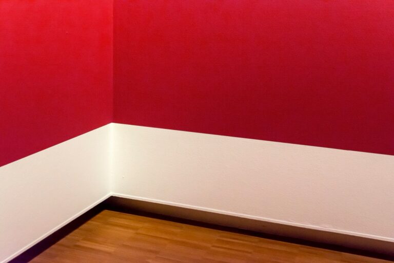
A satin or semi-gloss trim against a flatter wall color creates a visual line between the two surfaces, even when the trim and wall are close in color. That contrast is part of why white trim reads as crisp against a colored wall, not just because of the color difference but because the higher sheen catches light differently than the wall does. I painted a set of baseboards in eggshell once, matching the wall sheen exactly, and the room lost that clean separation between wall and trim. It wasn’t a disaster, just flatter and less defined than I wanted.
Primer sheen counts too
Primer is usually flat or a low sheen regardless of what topcoat is going over it, which is fine, since primer is meant to grip the wall and even out absorption rather than provide the final look. Where this trips people up is assuming primer sheen tells you anything about how the finish coat will read. It doesn’t. I’ve had a wall primed with a flat, chalky-looking coat that then took a semi-gloss finish beautifully, once the actual color went on in two full coats. Judge the primer on coverage and adhesion, not on how shiny or dull it looks going up, since that part of the job is temporary.
Sheen decides how a wall behaves after the paint dries. Color decides how it looks the day you finish.
Testing sheen, not just color
When I test a paint sample now, I ask for it in the sheen I actually plan to use, not just any sample can available. The same color in flat and in satin can look noticeably different once light hits it, since the higher sheen version will look slightly lighter and more saturated at certain angles. Judging a color in the wrong sheen is close to judging the wrong color altogether.
A quick way to decide
Ask how often a surface gets touched, and how much light hits it directly. High touch and high light both push toward a higher sheen. Low touch and soft, indirect light both allow for something flatter. My stairwell, in hindsight, was exactly the kind of high-touch surface that needed satin from the start. I repainted it two years later, same color, this time in satin, and it has held up without a mark since.