This article may contain affiliate links. If you buy through them, Decorating Our Space may earn a small commission at no extra cost to you. Learn more.
The first gallery wall I ever hung went up in an afternoon and came down within a week. I had laid the frames out on my bedroom floor, liked the arrangement, and transferred it straight to the wall using guesswork and a level. On the wall, with actual depth and actual light, the spacing looked uneven in a way the floor never revealed.
Now I do not hang a single frame until I have taped paper templates to the wall itself. It takes longer up front and saves an evening of patching nail holes later.
Step one: trace and cut
Trace the outline of every frame onto kraft paper or newspaper, cut it out, and label each cutout with the frame it represents. This step feels tedious with more than eight or nine pieces, but it is the only way to test spacing at true scale, in the actual light of the room, against the actual wall color.
Step two: choose a shape and an anchor point
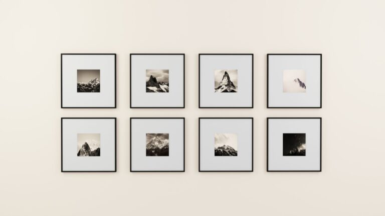
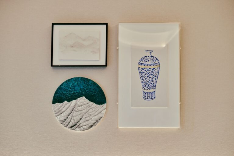
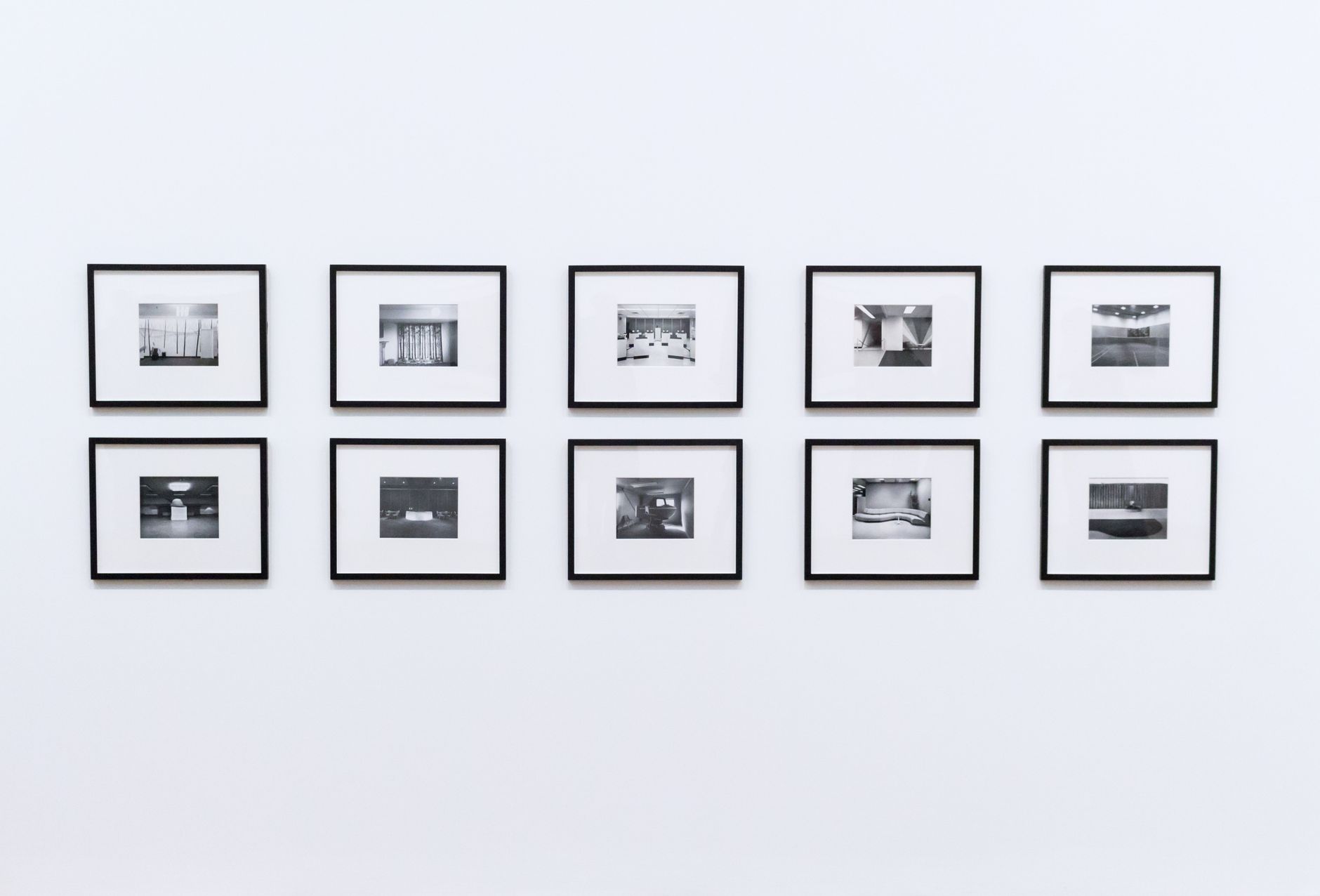
Gallery walls generally fall into one of three shapes: a grid with even rows and columns, a symmetrical arrangement built outward from a center line, or an organic cluster with staggered edges. Pick one before you start taping, because mixing approaches mid process is how walls end up looking indecisive.
Pick one piece as the anchor, usually the largest or the one you care about most, and place it first. For a grid or symmetrical layout, the anchor usually goes at the visual center. For an organic cluster, I put the anchor slightly left or right of center and build the rest around it, which reads as more natural than dead center placement.
Step three: tape, step back, adjust
Tape each paper template to the wall in position using painter’s tape, keeping 2 to 3 inches between pieces for a cohesive look or up to 4 inches for a more relaxed spread. Then walk to the other side of the room and look at it from where you actually sit or stand most often, not from three feet away.
I leave templates up for at least a full day, sometimes two, and check them again at night with the lamps on. Overhead light and lamp light change how a cluster reads, and a spacing that looks fine at noon can look cramped after dark.
- Keep the group’s overall outer edge roughly aligned, even in an organic layout, so it reads as one composition rather than debris.
- Vary orientation and size within the cluster, but avoid putting your two largest pieces directly next to each other.
- Leave a little more breathing room at the bottom of the arrangement than the top. A cluster that is tight at the bottom and loose at the top can feel like it is tipping over.
Step four: mark and measure hanging points
For each template, measure from the top edge down to where the wire or hook sits when the actual frame hangs, and transfer that measurement onto the wall through the paper. A nail through the paper template, right at the marked point, saves you from doing separate math for every single piece.
Step five: hang from the anchor outward
Hang the anchor piece first, remove its paper template, and check it against a level before moving to the next. Work outward from there rather than left to right, since the anchor is your reference point and small drift compounds the farther you get from it.
A gallery wall is not a single decision. It is dozens of small decisions that only look effortless once they are all made correctly.
What I would tell myself on that first attempt
The floor lies to you. Vertical space reads completely differently than horizontal space laid flat, and a spacing that looks generous on the floor often looks tight on the wall because your eye takes in a vertical composition differently than a horizontal one. The paper template process exists specifically to correct for that gap between how a layout looks lying down and how it looks hanging up.
I also used to rush the leveling step, eyeballing it because the level felt like overkill for small frames. It is never overkill. A quarter inch of drift on one frame in a nine piece grid is invisible on its own and glaring once you have four frames compounding the same drift in the same direction.
Handling an oddly shaped wall
Not every wall is a clean rectangle. Doorframes, light switches, thermostats, and sloped ceilings all interrupt the space you actually have to work with. When I planned a gallery wall around a doorway in my old apartment, I stopped trying to force a grid across the whole span and instead treated each side of the doorway as its own smaller composition, loosely balanced against the other side rather than perfectly mirrored.
Light switches and outlets are easiest to work around by simply leaving a little extra breathing room near them rather than trying to hide them behind a frame. A frame hung too close to a switch plate reads as an afterthought once someone actually goes to use the switch and has to reach around the art.
Adding to a gallery wall later
A gallery wall does not have to be finished the day you hang it. I left a gap in one corner of mine on purpose, aware that I would eventually find another piece worth adding. When that piece arrived nearly a year later, the paper template process happened again, just for the one new spot, checked against the existing arrangement rather than planned from scratch.