This article may contain affiliate links. If you buy through them, Decorating Our Space may earn a small commission at no extra cost to you. Learn more.
I reframed the same watercolor print three times before I understood what was actually wrong with it. The first frame was thin black metal with almost no mat. The second was a heavy carved wood frame I found secondhand. Neither looked right, and it took a friend who works in a frame shop to point out that the problem was never the frame material at all. It was the mat width.
Mat width sets the mood before color does
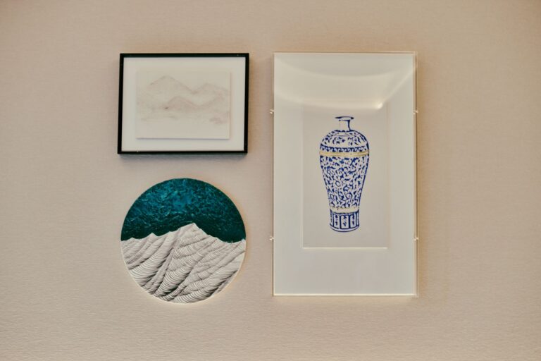
A narrow mat, an inch or less, makes a piece feel casual and a little cramped, like a photo dropped straight into a frame with no room to breathe. A wide mat, 3 to 4 inches or more, gives the piece visual quiet and makes even an inexpensive print look considered. Most frame shops default to a 2 to 2.5 inch mat, which works as a safe middle ground, but going wider almost always reads as more intentional, not less.
For my watercolor, the fix ended up being a 4 inch mat in a plain white frame. The wide mat gave the piece room to exist without competing with anything, and the frame stopped mattering nearly as much once that space was in place.
Bottom weighting
Traditionally, mats are cut slightly wider at the bottom than the top and sides, usually by a quarter to a half inch. This corrects for an optical effect where equal margins make the image look like it is sliding down out of the frame. It is a small detail, but once you notice a piece without bottom weighting, you start seeing it everywhere.
Frame material changes how a piece sits in a room, not how good the art is
Wood frames, especially in warm tones, tend to soften a piece and pull it toward a room’s existing furniture. Metal frames, particularly black or brushed brass, sharpen the edges of a piece and make it read as more graphic. Neither is better. They are doing different jobs.
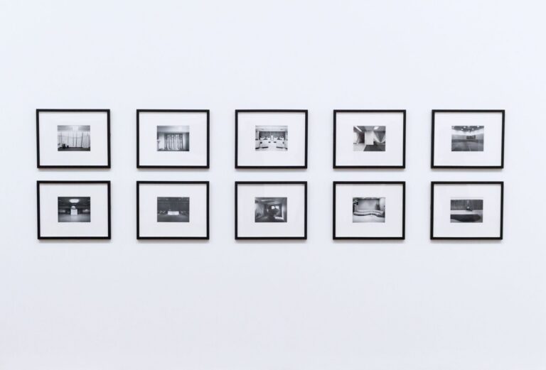
- Thin black metal works well for photography and line drawings, where a crisp edge suits the content.
- Natural or white washed wood suits botanical prints, watercolors, and softer subject matter.
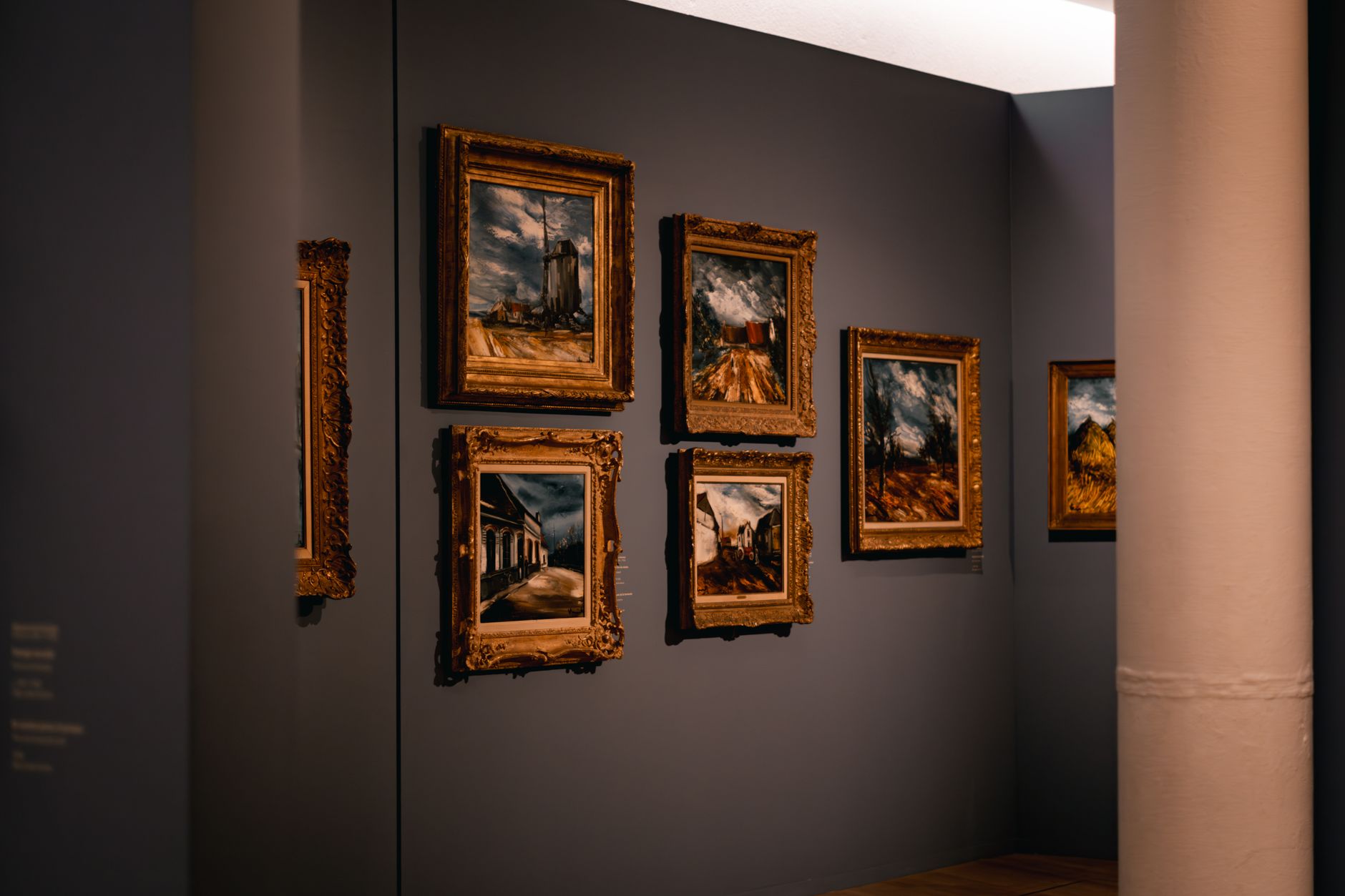
- Dark wood or brass reads more formal and pairs well with older, more traditional pieces.
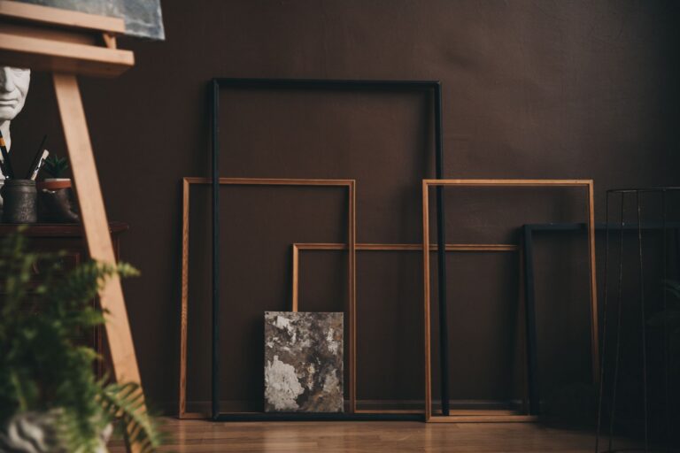
- No frame at all, just a canvas or a print mounted to board, works for large scale pieces where a frame would only add visual weight the piece does not need.
Matching frames across a room
You do not need every frame in a room to match, but I keep to one or two metals and one or two woods total, rather than letting every single frame be its own decision. In my hallway gallery wall, every frame is either black metal or unfinished oak, nothing else, and that restraint is what makes eleven mismatched sized frames read as one collection instead of a yard sale.
Glass versus acrylic
Glass is the default and it is fine for most pieces, but it adds weight, which matters if you are hanging on drywall with a standard picture hook rated for only a few pounds. Acrylic glazing weighs a fraction of glass and works well for larger pieces where weight is a real concern, though it scratches more easily during cleaning, so avoid paper towels or anything abrasive on it.
Non glare glass is worth the extra cost for anything hung across from a window or under a bright overhead fixture. I learned this after hanging a large framed print directly opposite my kitchen window, where the glare made it nearly impossible to see the image itself for most of the afternoon.
The mat is doing more work than the frame most of the time. Get the mat right first, then choose a frame that gets out of the way.
UV protection for anything that matters
Standard glass and acrylic offer very little UV protection, and a piece hung in direct or even strong indirect sunlight will fade over years. Conservation grade glazing costs more but is worth it for anything irreplaceable, a family photograph or an original piece rather than a print you could order again. For everything else, simply keeping art out of direct sun does most of the protective work for free.
Double mats and colored mats
A double mat, a thin strip of a second color showing between the main mat and the artwork, adds depth without adding much visual weight, and it works well when a piece has one dominant color you want to echo subtly. I avoid full colored mats in anything but a narrow accent strip, since a wide colored mat tends to compete with the art rather than support it, especially years later when trends around color move on and the piece starts to look dated.
Off white and warm white mats generally age better than stark bright white, particularly for older photographs or vintage prints, where a warmer tone feels period appropriate rather than clinical.
When to skip the mat entirely
Not everything needs a mat. Canvas prints, gallery wrapped pieces where the image continues around the sides, and large scale photography printed directly to metal or acrylic are usually meant to be framed without one, or not framed at all. Adding a mat to a piece designed for a clean edge to edge look usually fights the piece’s original intent rather than improving it.