This article may contain affiliate links. If you buy through them, Decorating Our Space may earn a small commission at no extra cost to you. Learn more.
I once stood in my own hallway and realized the paint colors on either side of it had nothing to do with each other. The living room was a warm terracotta. The room just past it was a cool blue-gray. Each color worked fine on its own. Together, walking from one to the other felt like crossing into a different house.
Flow doesn’t mean matching
Getting colors to flow between rooms doesn’t mean painting everything the same shade, or even staying within one narrow color family. It means the colors relate to each other in some deliberate way, whether through shared undertones, a consistent level of intensity, or a repeated accent color that shows up in more than one room. Without that connection, even colors that are individually well chosen can feel disconnected the moment you can see two rooms at once.
Start with what stays constant
- Flooring that runs through multiple rooms, since it sets a baseline every color needs to sit well against.
- Trim color, if it’s consistent throughout the house, which usually means every wall color needs to look good against that same white or off-white.
- Any large, fixed feature like a staircase, a stone fireplace, or built-in cabinetry that multiple rooms share a view of.
Pick undertones, not just colors
I started paying attention to undertone instead of just color family after that hallway experience. A warm terracotta and a cool blue-gray sit at opposite ends of the undertone spectrum, one leaning toward red and orange, the other leaning toward blue. Rooms with opposing undertones next to each other are what usually creates that jarring feeling, even when the colors themselves aren’t clashing in an obvious way.
Once I repainted, I chose a warm gray for the room next to the terracotta living room, something with a slight red or brown undertone rather than a cool blue one. The two rooms still look different from each other. They no longer feel like they belong to different houses, because the undertone underneath each color is now speaking the same language.
Let intensity step down gradually
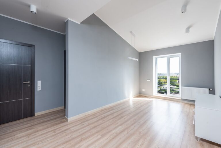
A bold, saturated color in one room next to a very pale, muted color in the adjoining room can create a similar disconnect to mismatched undertones. I’ve found it works better to let intensity shift gradually as you move through connected spaces, rather than jumping from a deep, rich color straight into something pale and washed out. A hallway or transitional space is often the right place for that middle step, holding a tone between the two rooms it connects.
A house doesn’t need one color. It needs colors that were clearly chosen with each other in mind.
Sightlines decide more than square footage
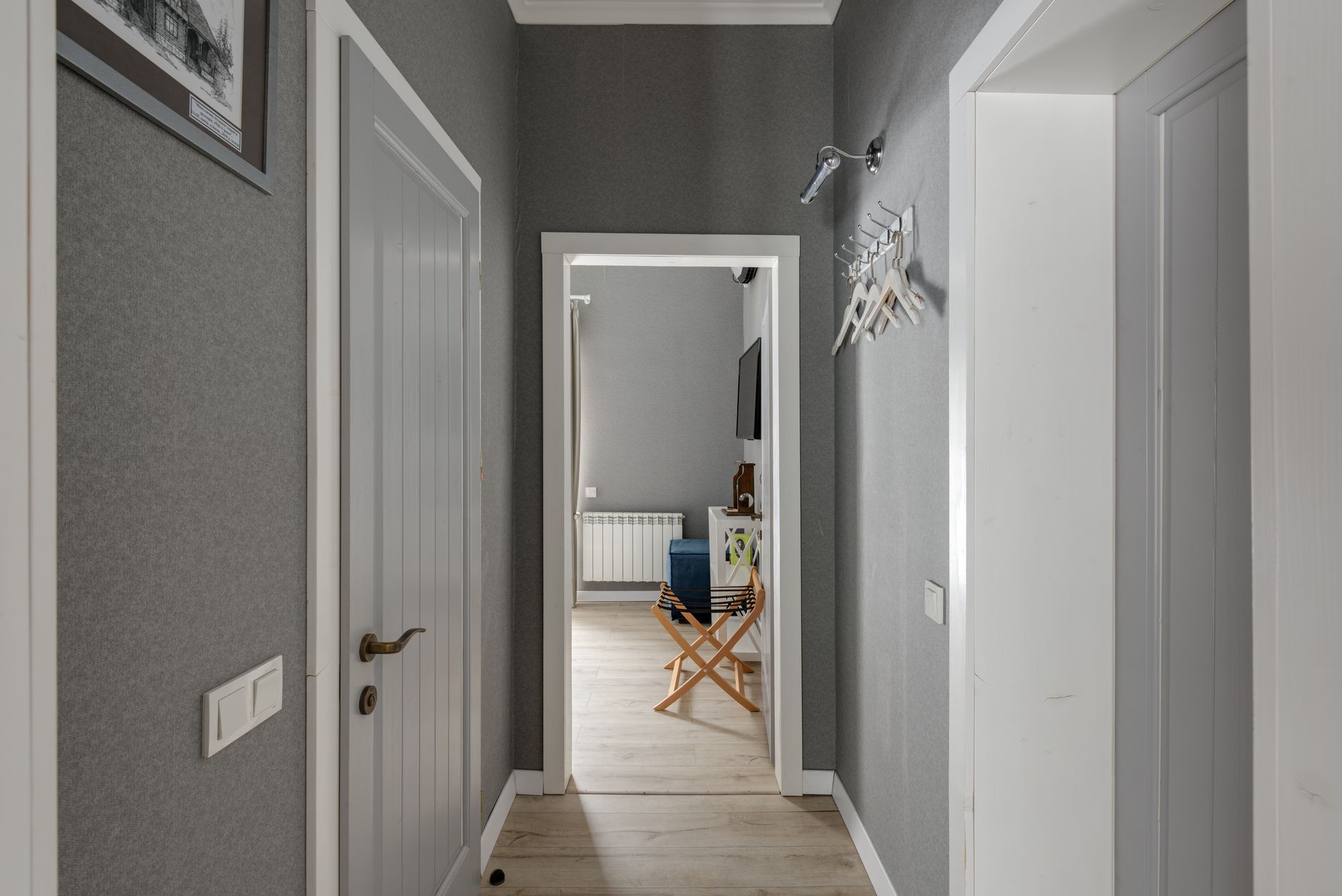
The rooms that need to relate to each other aren’t necessarily the ones next door on a floor plan. They’re the ones you can see at the same time, standing in one doorway looking through to another. I have a small office that shares almost no wall with my living room, but you can see straight through both from the front door, so I treat their colors as a pair even though they’re not adjacent in any other sense. Meanwhile, two bedrooms that share a wall but never appear in the same sightline have almost total freedom to be unrelated, since no one experiences them together.
A simple way to check
Walk your main paths through the house, the routes you actually take most often, and note which rooms are visible from which doorways. Those sightline pairs are the relationships that matter most for flow. Rooms that are only connected on paper, through a hallway you rarely linger in, need far less coordination.
One thread repeated, not copied
The easiest way I’ve found to tie rooms together without making them identical is repeating one element across a few rooms in different forms. In my house that’s a muted sage green, used as the main wall color in one room, a smaller accent wall in another, and just a throw pillow or two in a third. It shows up at different volumes, but it shows up, and that repetition does more to make the house feel considered than matching every wall ever could.
Flow isn’t about eliminating contrast between rooms. It’s about making sure the contrast feels chosen, not accidental, the way my terracotta and blue-gray once did before I understood what tied a house together and what pulled it apart.